LONG RANGE STUDIO VISITS
CAROLINE COLLOM + RICHARD GRAVILLE
This virtual studio visit brings together two abstract painters. Caroline Collom lives and works in Sydney, Australia and Richard Graville in Brighton, UK. The conversation took place on line and they talk about inspirations in their surroundings, such as architecture and wildlife, their use of colour and continuing their practice during the pandemic.
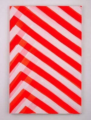
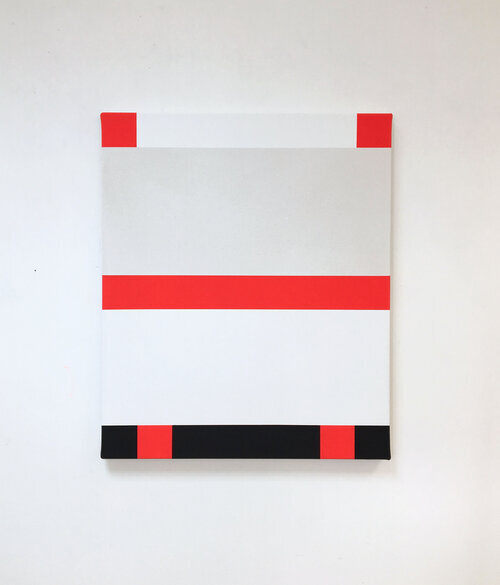
Richard Graville, BLUSHING PHANTOM (2019) Flashe on Canvas, 120x80cm
Richard Graville’s practice shares visual codes used by animals to protect themselves. He transposes these codes into artworks using the vocabulary of geometric abstract painting as camouflage and incorporates forms that are designed to act as warnings. The aposematic codes they utilize pre-date human evolution. He takes direct inspiration from the human contexts in which these codes are used to gain attention. In his most recent paintings Graville specifically references the reflector plates used on large goods and emergency vehicles to alert drivers on fast moving roads.
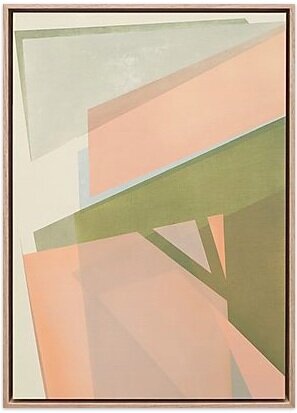
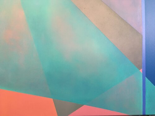
Caroline Collom, DOCKS, oil paint on paper, 45x62.5cm
For Caroline Collom painting is at the forefront of her practice and how she makes her work whether this is with a brush on canvas or other materials such as metal, wood or glass; and for this reason she is heavily aware of the post-medium condition she is practicing in with regards to painting. Creating a spatial field and three dimensionality to the work through objects in the space or forms within a painted ground is her primary focus when making pieces.
Caroline Collom: How are you and your studio going?
Richard Graville: I can’t get into my studio at the moment, it is frustrating especially because I was just about to move into a better space at the complex where I am situated. I am working from home at the moment but surrounded by family, we have two grown up children and live in a flat so it's quite tight. What about you?
CC: I am sure everyone is in a frustrating/weird situ with their studio but that must be so annoying considering you were about to move. Where is the complex? I am based in Sydney but 3 weeks ago I was aware things were getting bad and decided to pack a carry on and get on a flight back to the UK to be with my parents who are in that older bracket and have a business. We have some space which is nice and I have somewhere I can make a studio which is good. I am however concentrating on helping them with their business so have had to put the art making to the side for a while. Not long though! I usually work business hours in the studio so it will be weird not going there everyday. Yourself?
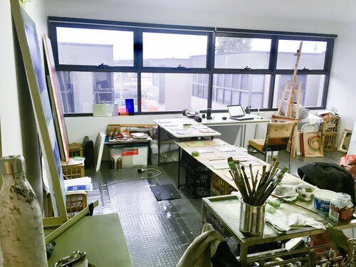
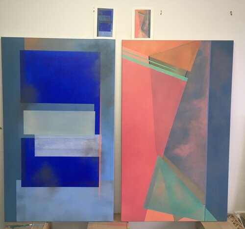
Richard Graville’s Studio shot, January 2020
RG: I usually put in a full day when I get the chance to go to the studio. I support myself with other work (painting and decorating recently!). I find if I start early before distractions set in I have a much better and more productive day. I live near Brighton and the studio is about 20 mins away in the car. I saw your studio shot, it looks very big and lots of natural light. Is it part of a studio complex?
CC: I too do some other work - freelance admin on the computer which has fortunately meant I can continue whilst away. I moved into my new studio at the beginning of the year and it is great - it took 2 other studios to find out what I want - controlled temperature! Air con and a closed door so no dust. It is owned by the artist Kate Baker who is really inspiring to have around. We just come and go really, but it’s nice to have like minded people around which I didn’t have in my last place.
What medium do you work in? Do you have a nice community? Have you/they reached out during this time?
Caroline Collom’s Studio shot
RG: I am working mostly with Flashe paints on canvas, I have connections with other abstract artists in Brighton and participated in an exhibition called ‘Hard Painting II’ in January with them and other UK artists. I am also involved with ‘NoHawkers’ a gallery initiative set up by a friend. We were planning to do a symposium about residencies at the beginning of May but that won’t happen now. I was going to talk about PADA because so many artist friends were interested. I remember seeing your work at PADA, in the abandoned paint factory. It was starting to ‘blend in’ with its surroundings - in a good way! I was hoping to do something in the factory but ran out of time. I was intrigued to see that you had titled one of your shows ‘The Commute’ because I nearly titled a show that a while ago. At the time I was doing a long commute everyday to London and all the work I was making at the time was based on things I saw out of the window of my train or while walking along the street. Are you always working in oils? I keep thinking I should use more oil paint!
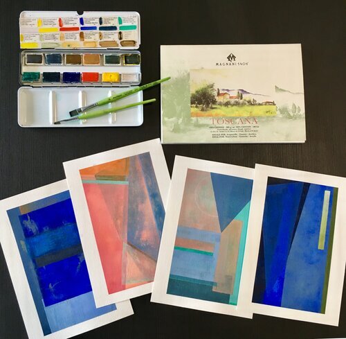
Caroline Collom, Finished commissions - sketch to piece
CC:I haven’t used Flashe paints but can now see that you use them and when I saw your work (love by the way) I instantly thought of Peter Halley and wondered whether you liked his work or had any correlations between his work or writings?
I will have to check out the pictures from ‘Hard Paintings II’ and discover new artists which is why I love PADA as it always has so many fantastic artists to discover. I think you should definitely do ‘NoHawkers’ online and get PADA involved, so many artists would find that so useful. I know I would.
Thank you, I am so happy you saw the piece and as planned is eroding/blending into the space. I did it in the last 3 days and it was a push ..the time just flew there but I knew I had to get something in there as I just loved the space.
Yes, ‘The Commute’ is pretty much that. I walk everywhere and always take in the shapes of architecture and colours and sometimes (all) I zone out and just see shapes and form in a blur and feel that my work is all about that. The sculptures in the show are meant to be moments of colour/form as you walk from A-B. Sometimes overlooked but the beauty in the mundane. Trying to not look at the phone but into the space we are commuting between.
I was really interested in your artists statement and the last line: “I find myself in the midst of, rather than on top of, this order.’ How do you start to unravel the chaos of the codes to create your paintings? And the link to animals?
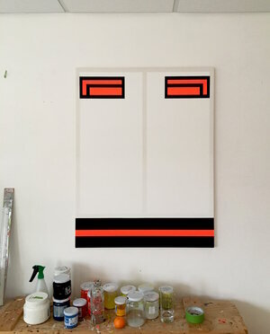
Richard Graville, FIRM, flashe on canvas, 50x40cm
RG: Yes I am a big fan of Peter Halley, I especially like the clarity of how he constructs his paintings and makes them about something very specific but then works out from there to create so many variations. I am trying to unravel the codes that I deal with and make paintings that are as simple and direct as possible. I have tried to use this enforced isolation to work on a sketchbook approach to pin it down as best I can. I see geometric abstraction as a vehicle to that end. The industrial surroundings in Barreiro were really helpful to enable me to ‘abstract’ the way humans use the same ‘codes’ as other animals. Everything being in a different written language but the same colour language.
The animal link started for me when I came across a book called ‘Animal Coloration’ by Hugh Cott. It is a book written in the early 40s during the second world war. It was used by the military to help them camouflage, confuse, hide from and distract the enemy. It used codes that animals have always used toward these ends in the wild. I realised that a lot of the things I was doing with my paintings were using the same techniques. I then decided to just go with it, so that in a sense since then I have always considered the paint as a kind of protective coat for the ‘artwork’.
Another artist I really like is Alan Uglow, an english artist that painted in New York. Very minimalist but very based on things seen in the world.
Whose work are you looking at? I thought of Richard Diebenkorn when I first saw your work. Did you find there were a lot of changes to your work after PADA?
CC: I find the animal coloration reference incredibly fascinating, it makes so much sense in your work. ‘paint as a kind of protective coat for the ‘artwork’ - it's a great way of putting it. It was interesting that you did a Graphic Design degree, have you always seen the world in a linear way with a coded system that informs the way you see things. One to put across a view and one to design it to do that?
Yes, Richard Diebenkorn for sure. Recently I have been trying to keep up with some current artists and learn new people working in the same manor. I posted a picture of Matthew Allen’s work and I love his technique and perfection. The reflection that involves the viewer in the work. I am also enjoying Ed Bats who had a show last year in Sydney and I like the spontaneity in his pieces. The list is endless, I also look at furniture design and architecture. I definitely think my work changed at PADA, I kept the controlled manner but learnt to ease up and be loose. Using spray paint and giving the work some character to the refined edges. I would shake and sweat before as it’s unlike me to work in a way I can’t edit or manipulate but I want to push myself further to create moments that are outside of this containment I create within the piece.
I haven’t read the book ‘The Case Against Reality’ but I will now and having read the blurb can see it may link to your work. Do you listen to podcasts by other artists or subjects that reflect your work?
Caroline Collom, studio now - pandemic essentials
RG: Looking at your paintings on your website there are two ‘The Old Paint Factory’ and ‘Portugal Nights’ where I felt like I knew exactly the colours you were referencing and the shapes you were using. Interesting how they awaken such specific memories that I wouldn't be able to articulate in words but have obviously lodged deep in my brain. ‘The Case Against Reality’ kind of takes the thinking around colour coding etc onto another level. It argues that we don’t actually perceive reality as it is but a coded version our mind can cope with in order to survive. And that, for example, certain colour combinations are hard wired into us to enable us to have survived thousands of years ago in the wild. My take on this is that usually the most dangerous things in our environment (visible at least!) are fast moving vehicles and the fact they are ‘painted’ with the same colour combos that wild animals use is no coincidence. I’ve used hi-vis for maximum visibility, but now I’m thinking I will calm the colour down because I don’t need that level of visibility in the context the paintings will (hopefully) be seen. The author of the book Donald Hoffman has done a Ted talk that is worth a look. He has a bit in it about Australian beetles!
There are two contemporary artists that come to mind, that I really like, in relation to your work - Matt Connors and Julia Rommel. Do you know them?
I do listen to podcasts and have enjoyed Talkart. There is one by David Zwirner called Dialogues - worth checking out the episode with Peter Schjeldahl - one of my favourite critics.
I also recently watched a documentary on Julian Schnabel ‘A Private Portrait’ on Netflix which is great fun. Will you be able to produce finished work while you are in the UK, or will it be planning things for when you go back to Australia? You have an exhibition planned at Fivewalls, what do you think will happen?
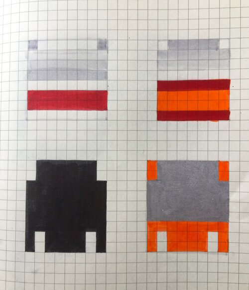
Richard Gaville, sketchbook, April 2020
CC: I am glad those paintings evoked those memories and for me makes me feel the paintings worked. I guess that is what I try to get back from the work. Sometimes when it's finished I am not sure and the only way to know is from the viewer which is nice I guess. I will have to read that book for sure as colour is so important to me and getting that depth of field. Have you read or looked through Josef Albers - Interaction of Colour - Highlighting what we as humans define first etc. Like getting an eye test really!
It would be interesting to see your paintings toned down and if the effects they have will be the same. Is it all about the contrast within colour picking? Have you worked off the canvas? In sculpture or a painting in a different shape within the space? Possibly this becomes too literal.
I know Julia Rommel’s work well but I am not too familiar with Conors work but it automatically reminded me of Matisse’s abstracts which I am very fond of. Thank you.
My exhibition at Fivewalls has been postponed and will be next year now. It is funny though as I was literally two days away from packing the car with all the work. I may re-work it now but I believe it is all done. I was also meant to have a residency in Paris in July. I was going to do a continuation of the smaller works, I guess I will do these in the UK. The gallery I work with in LA has decided to close which is awfully sad but also because I now have to ship the works back to the UK. I guess these things happen, but I am finding it hard to put everything to the back of my head and just make work. At the moment though I may just try and get all my website and instagram a little better as I guess that's our platform now.
Are you prioritising your other job now or can you?
Caroline Collom, Moments - texture
RG: Unfortunately I can't work at the moment, I was working in a house where there was a person who'd be classed as vulnerable so can’t even finish off that job. I am sorry to hear about LA, Paris and the exhibition. Frustrating for you, sounds like you had an exciting year lined up!
I was thinking the other day about the turmoil that was going on in the world when people were making amazing things during the 20th Century, so I just think you have to carry on. It is great you can work on a small scale.
Yes it is very much about colour contrast combinations for me but also very subtle differences in grays and whites, and how colour demands attention within a painting as well as being ‘less seen’ in places. I have enjoyed and been influenced by Albers, he is the master as far as I'm concerned about a lot of this stuff. When I was in Portugal I went to the Berardo Museum and saw a small painting by Mondrian that blew me away. It made me want to understand (as well as I could) the ‘codes’ I was dealing with rather than just reference them. I have often thought about changing the support/shape I'm working on but somehow for me it keeps coming back to the ‘code’ of the rectangle!
CC: Absolute master and un-pick those codes for sure - rectangle is the best anyway! I have really enjoyed this and thank you for being so generous with your practice and recommendations.
RG: OK sounds good, thank you for your thoughts and insight. Keep safe!
For more information and to see more examples of work visit
Caroline Collom and Richard Graville